5 Reasons You Should Be Using Storybook
Starting a project from complete scratch is quite a daunting task to consider as a Junior Developer. So, when the Partners squad, made up of myself and Ste Jackson, were assigned the task of developing a brand-new application form for the Zuto website, it was hard to choose where to begin!
As you can imagine, the only way you can tackle a mammoth project like this is with careful planning and strategic organisation of both your workload and the many different components your code base will be made up of.
Thankfully, we came across Storybook: a Sandbox environment and open-source tool for UI development.
With this handy software, no longer did we have to monotonously check through every component’s functionality or see how they affected the main application. Now we had the tools to create and test our components as they would appear in the application before any real development work began.
Storybook was so integral to our process that it made me question how you could create a front-end development project without it. For that reason, I want to share 5 pros of using Storybook.
1. It’s an interactive playground for UI components
One of the main benefits of Storybook is that it allows you to create components that are interactive rather than static. You can live-edit your creations, play around with the display and view how they would render in different ways.
For example, when we created our Button component for the application form, we had to consider the many different states it would include. Thankfully, Storybook offers Addons which expand the environment and allow a user to customise tools to fit in with their needs.
With the Controls addon, we were able to interact with the Button component without the need to code - we could determine appropriate modifications such as the Button variant, size, subtext, icon and whether it was disabled. Take a look…

By selecting different options in the dropdown menus or by inputting our choice of text, we were able to render whatever style of Button we liked immediately onto the page, without affecting the larger application.
2. You can test in isolation
This brings me nicely to another benefit of using Storybook — the ability to test and develop your components separately to the application, meaning project dependencies will not affect the behavior of components.
We found it extremely useful having a platform like Storybook isolated from the rest of our application as we could safely play around with component design and functionality without worrying about any pages being disrupted. That being said, as much as the platform was separate, it was also incredibly easy to integrate within our React application when needed.
Not only that, Storybook works with most of the other front-end frameworks too!
3. Allows for rapid UI development
Using Storybook hugely cut down our development time. This was due to the speed in which you can create components and how easy the software is to set up.
We used Storybook to create our components in real-time, which was aided by hot module reloading; whenever we made a modification, the module was replaced without the whole page reloading. This instant gratification helped us a lot and made sure we could design each component perfectly before integrating it within the rest of our app.
Additionally, the process of building a new story within our project was super simple and once we’d implemented one, we could easily tackle the rest without any (many…) hiccups. If you want to read more about implementing stories, you can do so here: https://storybook.js.org/docs/react/get-started/setup
4. Add handy documentation for other developers
With each story you make, you have the option to integrate the Docs addon, which allows you to add high quality documentation to your components.
We chose to incorporate this as we wanted to add in-depth documentation so that any other developer could access Storybook and immediately understand each of the component's capabilities and usages.
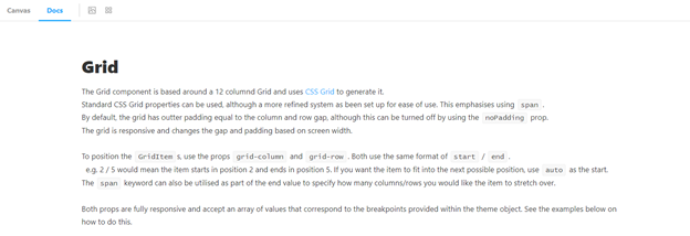
For example, we set up a design for our Grid layout within Storybook, which wasn’t quite as self-explanatory as some of our other components. For this reason, having the Docs addon right alongside the Grid canvas gave us the ability to describe exactly what was going on and how our app form layout was structured.


We believe this will be a handy tool for other engineers at Zuto and will save vital time in understanding components before you are able to work with them.
5. Great UI for great UI
Finally, what more do you expect from a design tool created for building clean and pleasing user experiences, than an easy-to-use, aesthetically pleasing UI?
The organised and structured design of Storybook allows the user to focus on what matters most: building their components quickly and efficiently.
Storybook aids this process by separating your components accordingly, as well as organising the specified Addons you have implemented. It was due to this that we were able to showcase the atomic design principles that were vital to our approach of building the new app form.
With Storybook, we were able to easily demonstrate which components were classed as Atoms, Molecules and Organisms, and see clearly how they all interacted with one another. Not only did this help us during development, but it will make it easier for any future users to understand the thought processes behind our approach.
These many benefits that Storybook offer, including the rapid development process, the handy documentation for other developers and the clean UI, greatly improved our time and efficiency in building the new app form. As a developer, you’re always on the search for software and tools that will make your life easier, and Storybook offers exactly that! We hope to branch out this development tool into other areas at Zuto in the future. Follow this link if you would like to learn more about what Storybook has to offer: https://storybook.js.org/
